

Background
Intro
More and more people use streaming services and the way we interact with it becomes part of our social-virtual lives. This case study examines how one of the biggest streaming services' interface can use enhanced features for their more than 100 million people world-wide to ease their navigation.
Prime Video for Web Browser
Most of us who own streaming devices know how easy it is to have a show on the background. However, watching a show on Amazon Prime on a web browser can become very cumbersome. There is clearly a disconnect between the Amazon shopping mainframe and the Amazon Prime Video website. Prime Video thus comes in short of becoming that "go-to" place for streaming videos despite its tremendous contents.

Amazon Prime Video Web
Why The Web App?
Because we spend so much time on our phones and laptops, especially since the pandemic, enhancing the web browser experience would be the most important challenge to tackle. I hope that some of these enhancements can be adapted in other streaming platforms such as TV interface.
Problems
Non-communicable Interface

-
There is clear disconnection between desktop, TV, and mobile devices: they all look different and it's hard to instantly make visual transition between different platforms.
-
The content 'looks' very disorganized: the pandemic definitely caused an overflow of streaming contents, but the tools provided for users have ceased to keep up with this influx.
-
UI Best Practice is failing - back in the day when we opened our phones, majority of our browsers automatically "shrunk" to fit whatever devices that were being used. But those are old days. We need easily translatable yet elegant UI for each device type.
-
Keeping design consistency: the online "warehouse" look of Amazon.com must be maintained. The lack of consistent 'look' between Amazon shopping and Video websites are not being played out in their advantage.
Observation
The Current Look
The current interface consists of a series of contents grouped in a horizontal format. Genres are mixed and feels very congested. Once you hover over your mouse it gives more options such as "add" or "trailers" while temporarily covering other shows behind the pop-up box.
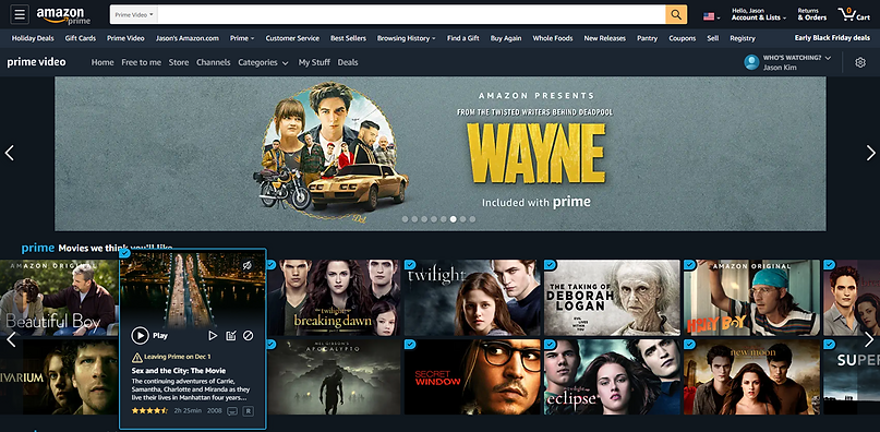
As you scroll down the side arrow appears for more contents. The grid becomes random in order to fit the rectangular posters. It is hard to pin down the logic between this shift in grid (between the rows), but rather seems random.

For instance, there are so many different icons and texts being introduced altogether. This can easily make the viewers overwhelmed. Also the fact that you can't really zoom in on a web browser (unlike your hand-held devices), the small texts and icons are unintelligible to most of us.
The logos
Amazon's Prime service has become a household name so having that arrow sign with the word 'Prime' Video makes the brand instantly recognizable. However, there are so many variations once a user enters the website.This gives false information because one might ask "am I on the right website?" or "Is this old?"


Each device uses different Prime logo. It is not driven by the device size so it is hard to justify this variation besides lack of update and attention.
Clutter and Lag
Another cumbersome feature of the Prime Video website is that the automatic hover-expand menu delays the scrolling effect and covers other posters. The distraction is evident from this action because it clearly discontinues the mouse flow. People should be able to have an option of viewing the trailer rather than instantly starting it when the mouse runs over them "by accident" or not.
Analysis
Comparison
Netflix
It's worth looking into how other competitors display their contents. Each has their own taste but the consistency is clearly visible. For example, Netflix utilizes consistent column grid vertically. With much enhanced contrast and bold fonts within each posters, it definitely presents the contents cleanly, highlighting certain information.

Apple TV +
Apple TV has that iconic rounded corners for each poster. Although the poster sizes vary within the page, it has the consistent "I'm watching Apple TV" effect. Apple's own UI elements, including animations, color and textures all promote a light and airy design language makes navigating more entertaining despite the lack of content variety.

Disney +
Similar to above, Disney + presents a very simple UI. Layout is fixed and not complicated at all. As the president of Disney Stream said, their goal is to provide simplicity and elegance, and not have the product to get in the way of the content - a stark opposite of Prime Video.

Key Takeaway Points
-
Creating a simple page that contents can live in a variety of ways seem to fit Prime.
-
Simple interface with interesting ways to present the content would be beneficial.
-
However, the page shouldn't overload with information.
-
Authority to easily navigate along with categorization control should be given to the users.
Re/Design
Layout Study
Iteration 1 :
Here we introduce the focused poster at the top and have all the other preview posters in the horizontal grid with no variations. This keeps the consistent look and feel of the current Amazon Prime (shopping) webpage.

Problems :
-
It lacks variety
-
The horizontal grid and poster thumbnail size allows large number of content materials, however it is ineffective.
-
It still looks overwhelming and overloaded with blocks.
Iteration 2 :
A second focused poster is introduced to break the horizontal grid structure, giving more room for newer contents. This allows variety of thumbnail sizes to exist within one page without creating too many variations.

Problems :
-
It is more inconsistent than the previous or current versions.
-
Depending on the device, a user may not see the full scope of the page which might make the page presented as unorganized.
-
The page overall layout feels foreign.
Iteration 3 :
Now we introduce bigger posters at the top carousel that are either trending or being advertised. The rest are consistent with the previous versions. In order to introduce a variety with scrolling, I placed the top horizontal focused poster to the mid-way of the page.

Problems :
-
Still retains small posters with too much data in each square, making it hard for users to find specific information they may want.
-
The focused poster in the middle looks like an ad. The disruption might kill the user flow.
Iteration 4: The New Design
I placed the horizontal banner at the top to maintain the hierarchy of the contents. I also increased the poster size giving more room for other information without having to hover over the mouse to get "more options" while maintaining the number of posters in each row low. Here I maintain the number of posters in each row to 5.

No matter how we organize the content materials the layout has a fixed number of options: being as consistent as possible without overwhelming the users with contents. Maybe the layout isn't the only way to resolve this problem.
Let's draw some inspirations from... Amazon itself!
Amazon's main hierarchy is absolutely amazing. The information is laid out in a way that draws information in an orderly manner.

Carousel
The current Prime Video uses some great features to engage users and provides more information such as the horizontal scroll. This hidden arrow that appears as the mouse hovers over is a great way to keep more contents.

Current "horizontal" version

New version
Some New Features...
Cover Art
Let's delve into what information are given and how they are presented on each poster. Each cover art can greatly reduce the information but give the users an option to view them by incorporating icons and filtering system.


Preferred poster type
This organization provides more information through identifiable icons rather than texts. It feels less forced and congested, freeing up more space for the content poster to show through.
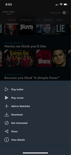
Popup Menus
If we can mainstream the secondary options such as "Add this season" and "Hide this season" into "my list", Like/Dislike, Other seasons, etc... the experience of navigating TV shows with multiple seasons and episodes would be much pleasant.


Search
%20Search.png)
%20Search.png)
I also created this remote control along with the search bar that follows as you scroll and hides when no movement is detected. This way one can search and control what is presented on the screen faster.
Filter
For the web Prime Video instead of having the sub horizontal menu at the top, we could perhaps make the use of the icons to categorize the contents. For example, having a variety of icons all at one for the website would let the users know immediately how the content is categorized. For the mobile devicew we could emphasize the most notable category iconx (maximum of two) to showcase them.

Current Version

New Version
With the cover art and navigation bar slimmed down specifically for streaming videos, the drop down menu can quickly sort out the contents without having to relocate to another sub page. As users click through their desired categories, the home page would live update with relevant contents.

Marie Kondo'd !
Now lets compare the old and new designs. As you drag your mouse from left to right you'll see the changed I've made. Pay attention to how the content information is presented differently.
Reducing the information and condensing it to fit within the poster box yet presenting them with the familiar Amazon graphics was the purpose of this new design. The new design also features hidden buttons, more top-down categorization, and remote controller. It also features less pronounced zoom and doesn't display extra information until the user actually clicks on the thumbnails.
Old Version
New Version
Adaptation
It is paramount that the user friendly interface and its information are retained when moving from one device to another without changing the design language. There are more works we can do to make this user-friendly interface more indispensable. Let's entertain some ideas..

TV/Phone
Despite the tvOS is based on iOS, the two operating systems aren’t interchangeable. While the design principles might change slowly, many best practices on mobile no longer apply on TV and thus would require more time to investigate. Unlike phone apps, TV is a huge canvas which offers enormous possibilities for designers. Using phone as a remote or TV as a mirror to the phone app would work with simple and elegant UI.

More control to phone
Smaller screens could use collapsed vertical menus instead. On the long-press, the bottom pop-up options show more features similar to mouse hover on desktops. Maintaining the icons and poster proportions would be great in order to maintain the styles on different breakpoints.

Another new feature would be to allowing mobile devices to "push" viewing options so that the TV mirrors the phone. On the phone app the chosen content is then focused with a darker background while the show is playing. One can also "unlink" the devices.
Conclusion
Thoughts
This case study looked specifically into what was missing in Amazon's Prime Video. After the study I was also able to step back and look at the bigger picture and realize what I wanted to apply this knowledge on other platforms- being able to create a design that fits the brand while enhancing the experiences for users makes a successful progress.
Learnings
I learned the value of small design changes that could cause bigger impact. Creating a small icon, for example, could reduce unnecessary information and create room for other more valuable features. Amazon's Prime Video has so many great contents but it seemed to limit itself by making the end users feel they are given "too much" information. Through examining its own design features and layouts, and comparing with other competitive streaming services such as Netflix and Disney, I was able to tone down and create much simpler interface.
Old isn't always bad!
One important take-away message I have learned through this process was that I had to constantly remind myself to evolve the existing design rather than creating something completely new. It is much harder to transform a group of complex menu or thumbnails into much simpler yet elegant composition. This is what users will ultimately appreciate, because old ways aren't always bad. Especially when it comes to Amazon. If you look at the history of the website, the design "feels" and "looks" have not changed dramatically]. Perhaps that's why Amazon always feels so familiar to us. The value of Prime cannot be measured, and it shouldn't certainly resemble other streaming services.